close up on lowercase glyphs
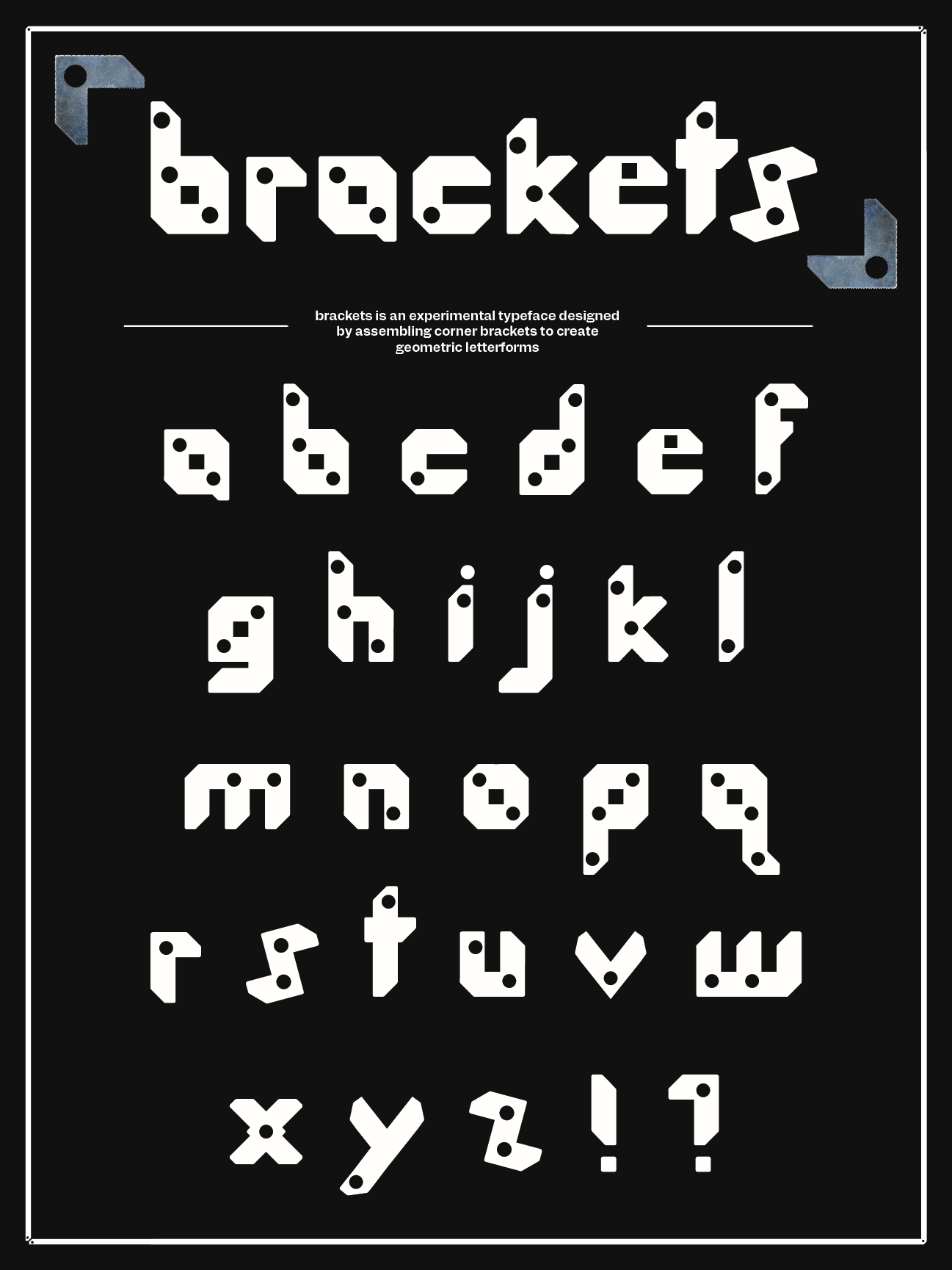
final poster for exhibition
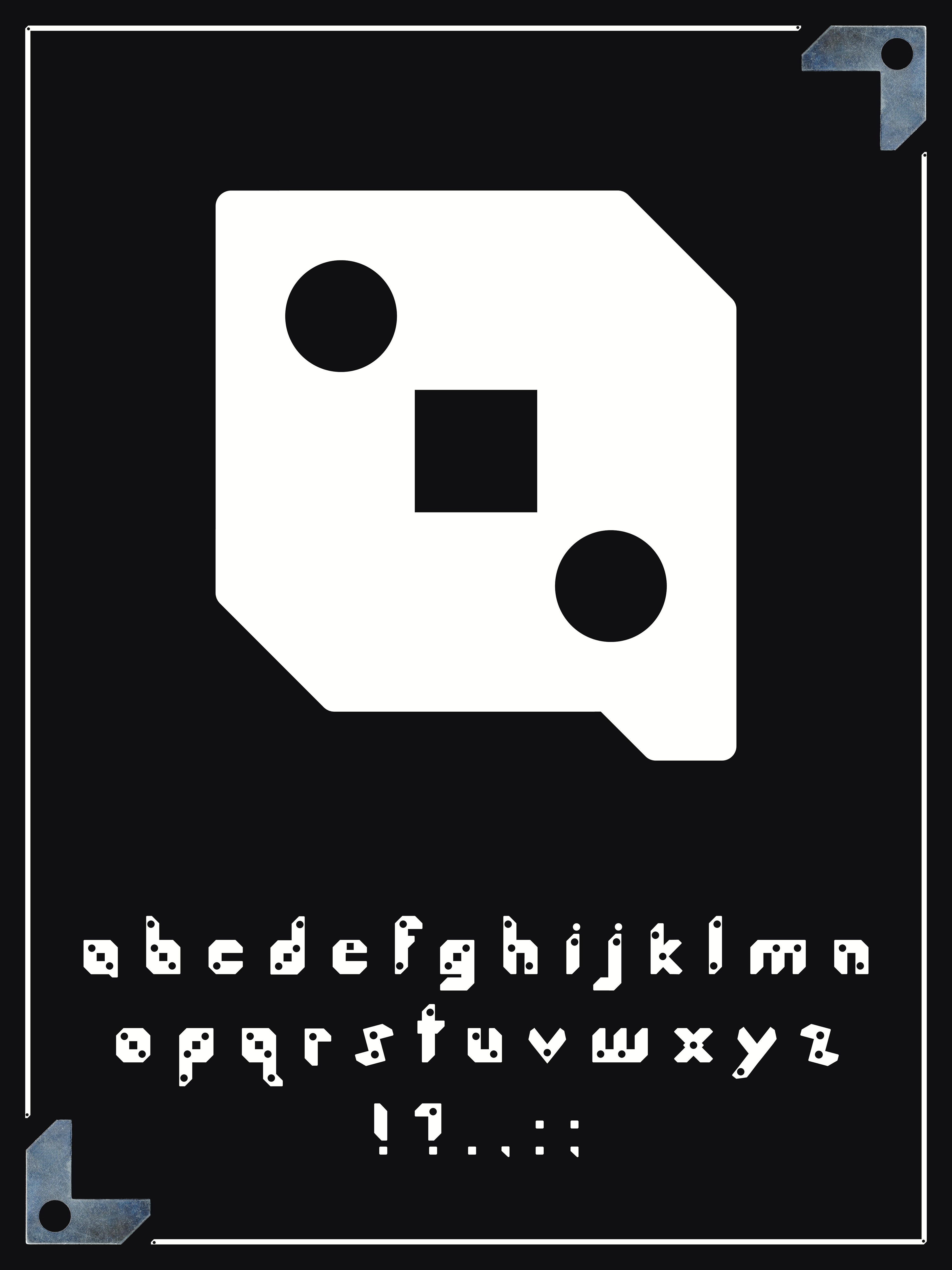
alternative poster

Brackets is an experimental typeface inspired by a found object: the metal corner brackets used to secure picture frames. The design explores the geometric character of these forms, reinterpreting their structure into a cohesive typographic system. The result is a modular typeface that balances rigidity and rhythm. Using a corner bracket as the basic unit allowed me to push the form to its limits. Basic variations of the bracket produced a set of forms that could then be constructed to create letters. These variations, in pieces, created the underlying language of the typeface. A deconstructed bracket created a system for ascenders, descenders, and counters which could be assembled like a puzzle. Designing the typeface showed me the similarity of Latin letterforms. A lowercase a, o, e, c, share similar counters, while a b, d, h, k, l, in turn, help produce n, m, w, q, and p. A poster displaying each glyph of the typeface was selected for Atelier Next Door’s Open Type Exhibition in January 2025 in Toronto. The letters were then made available in Regular and Light weights using Glyphs 3.