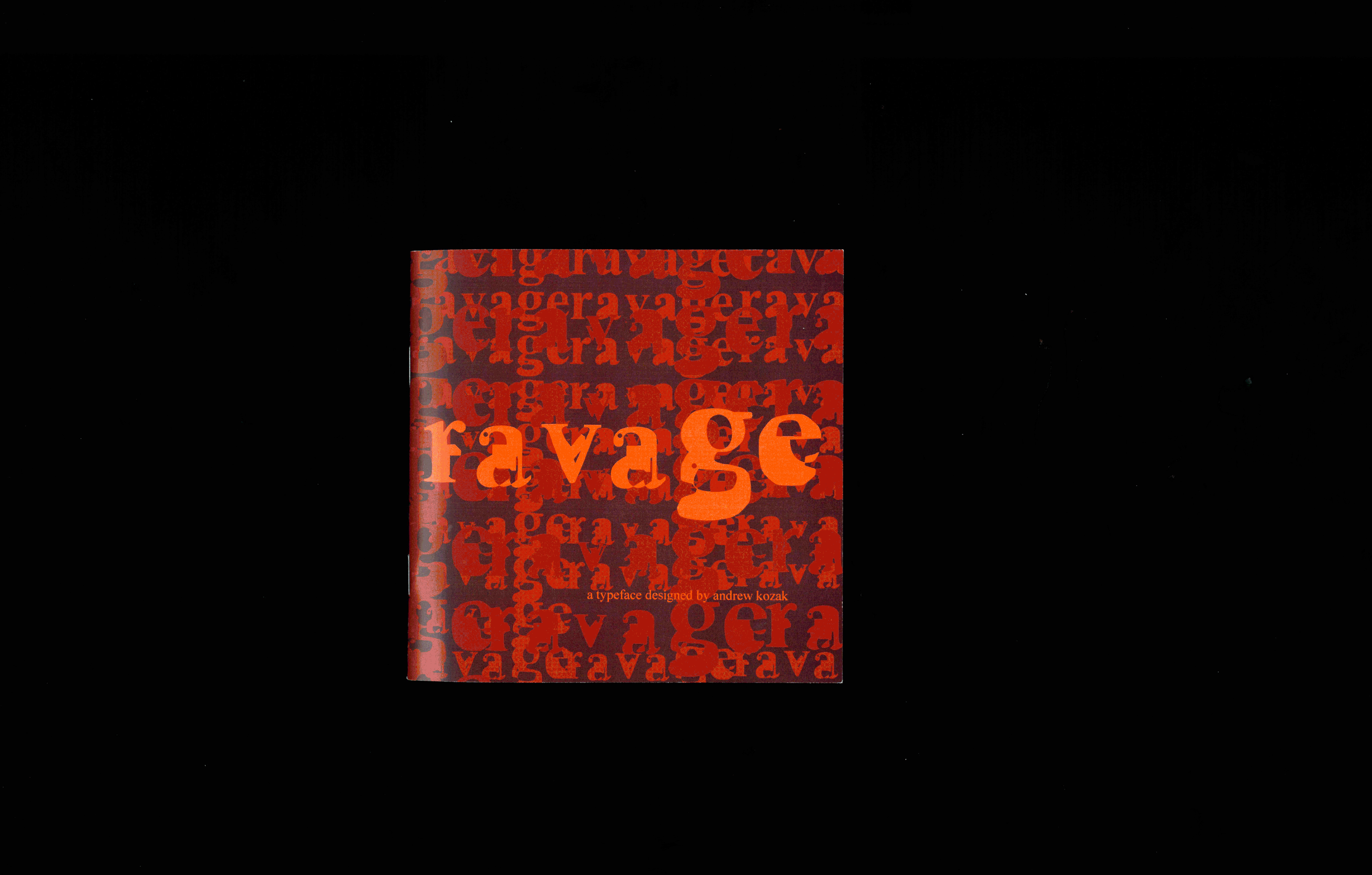
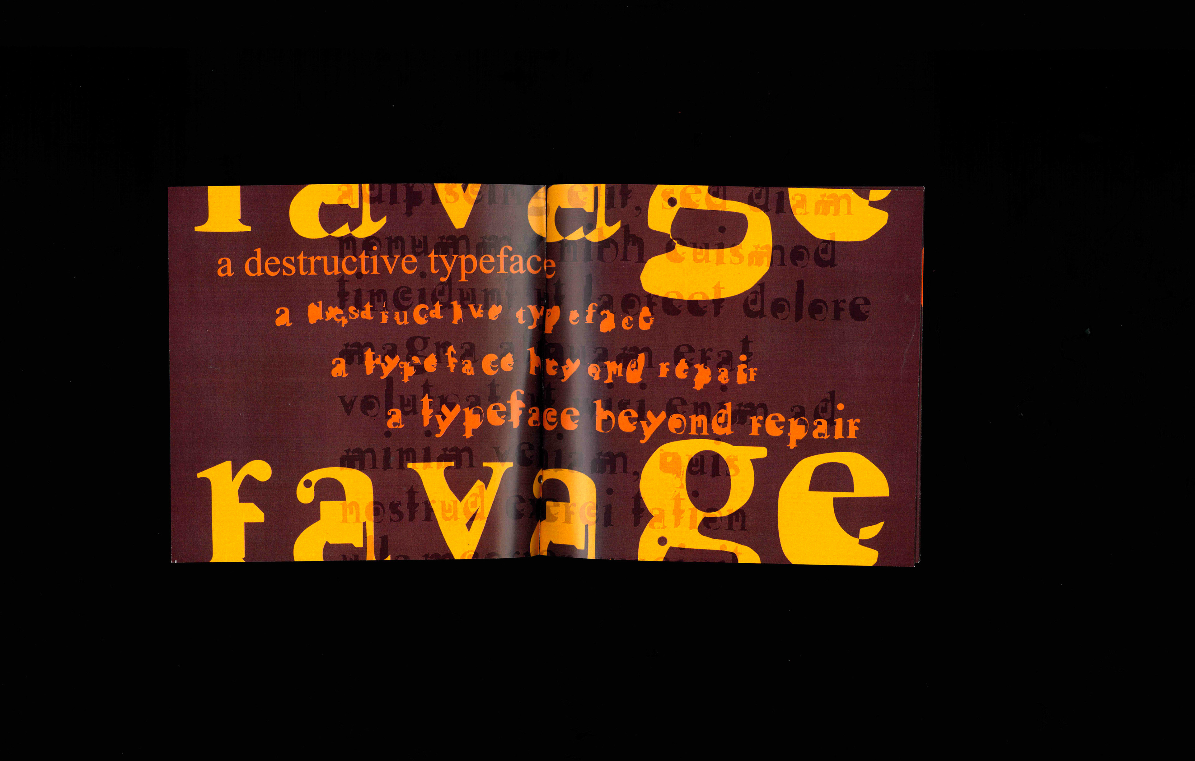
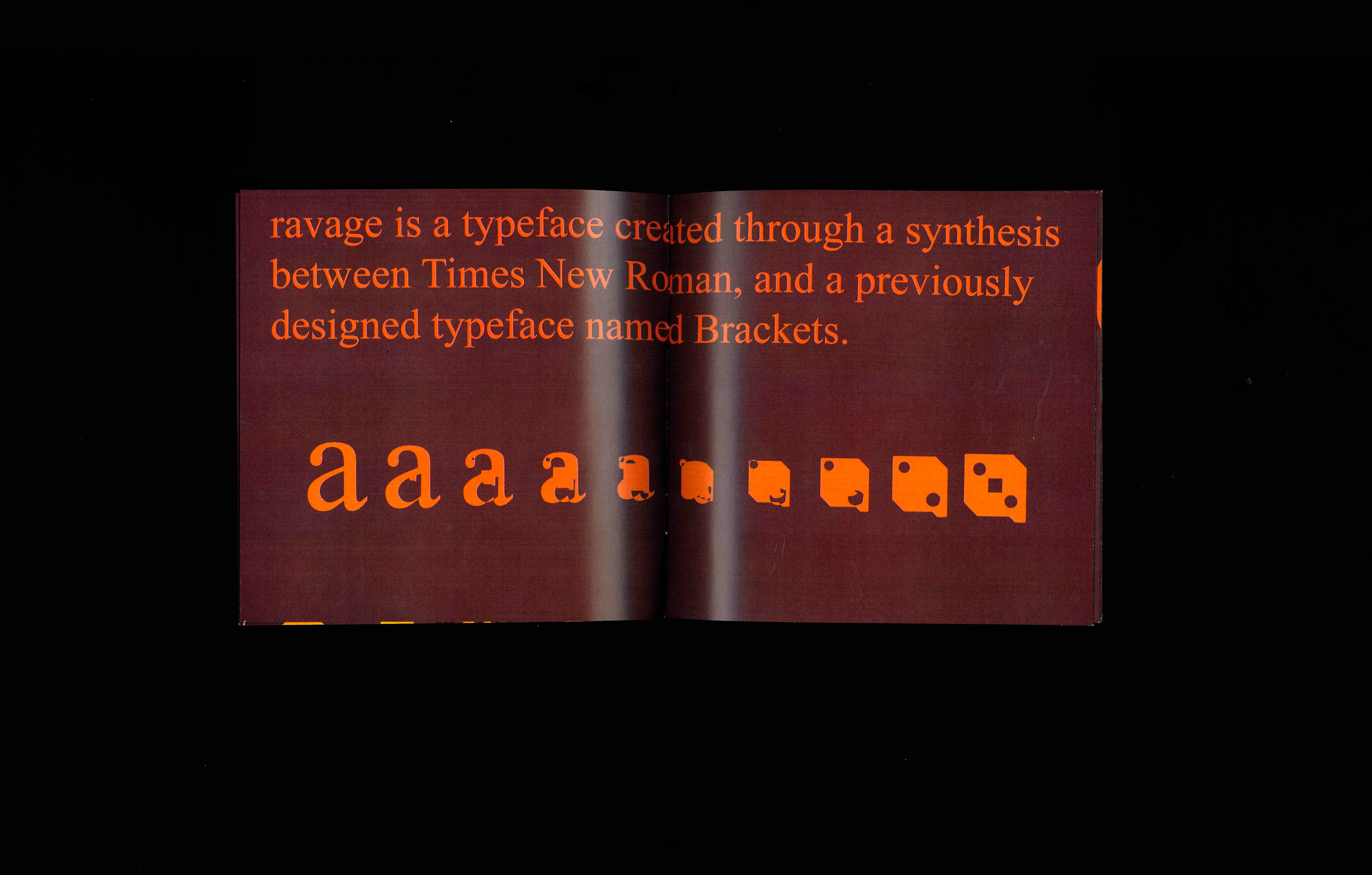
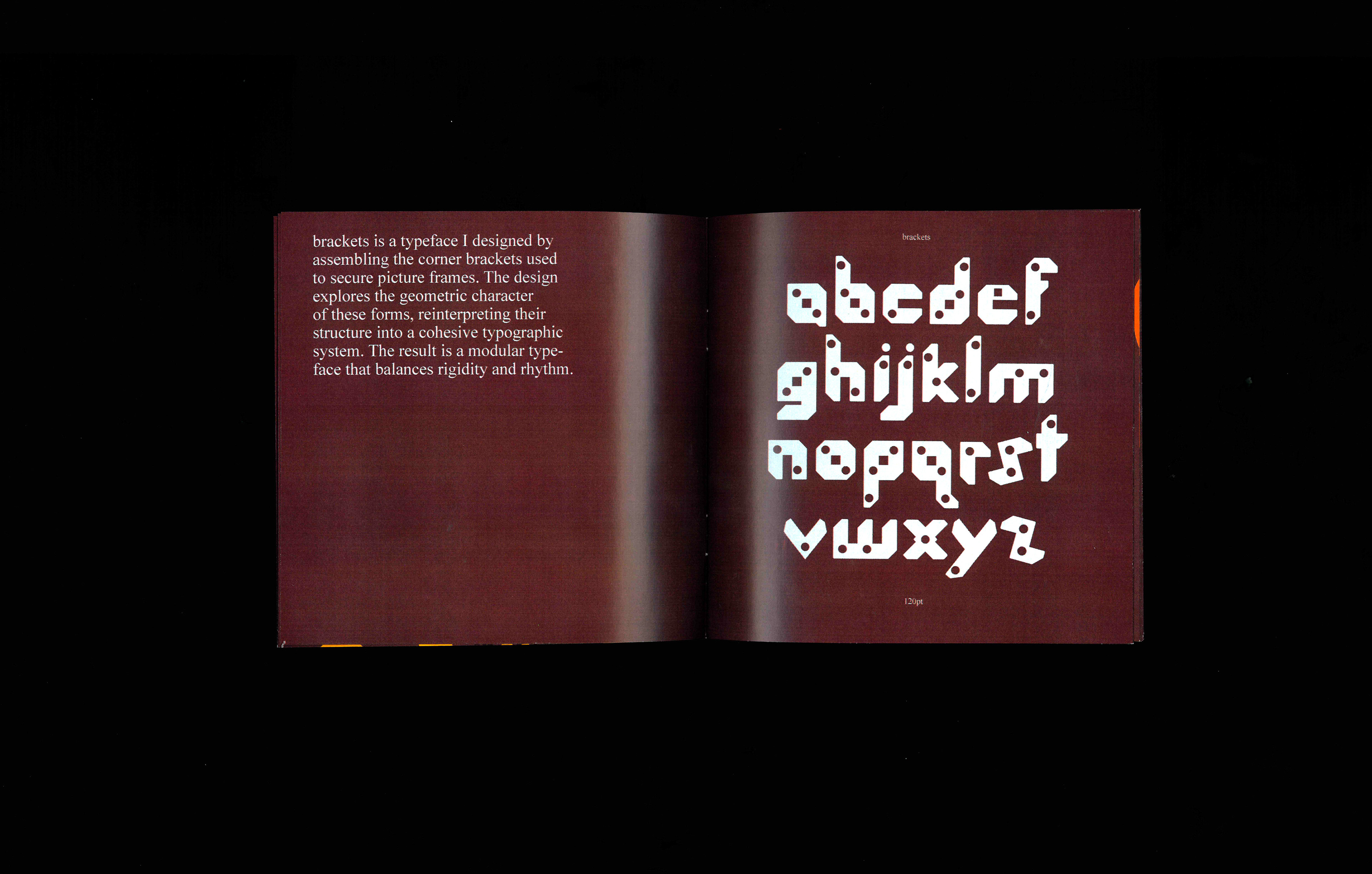
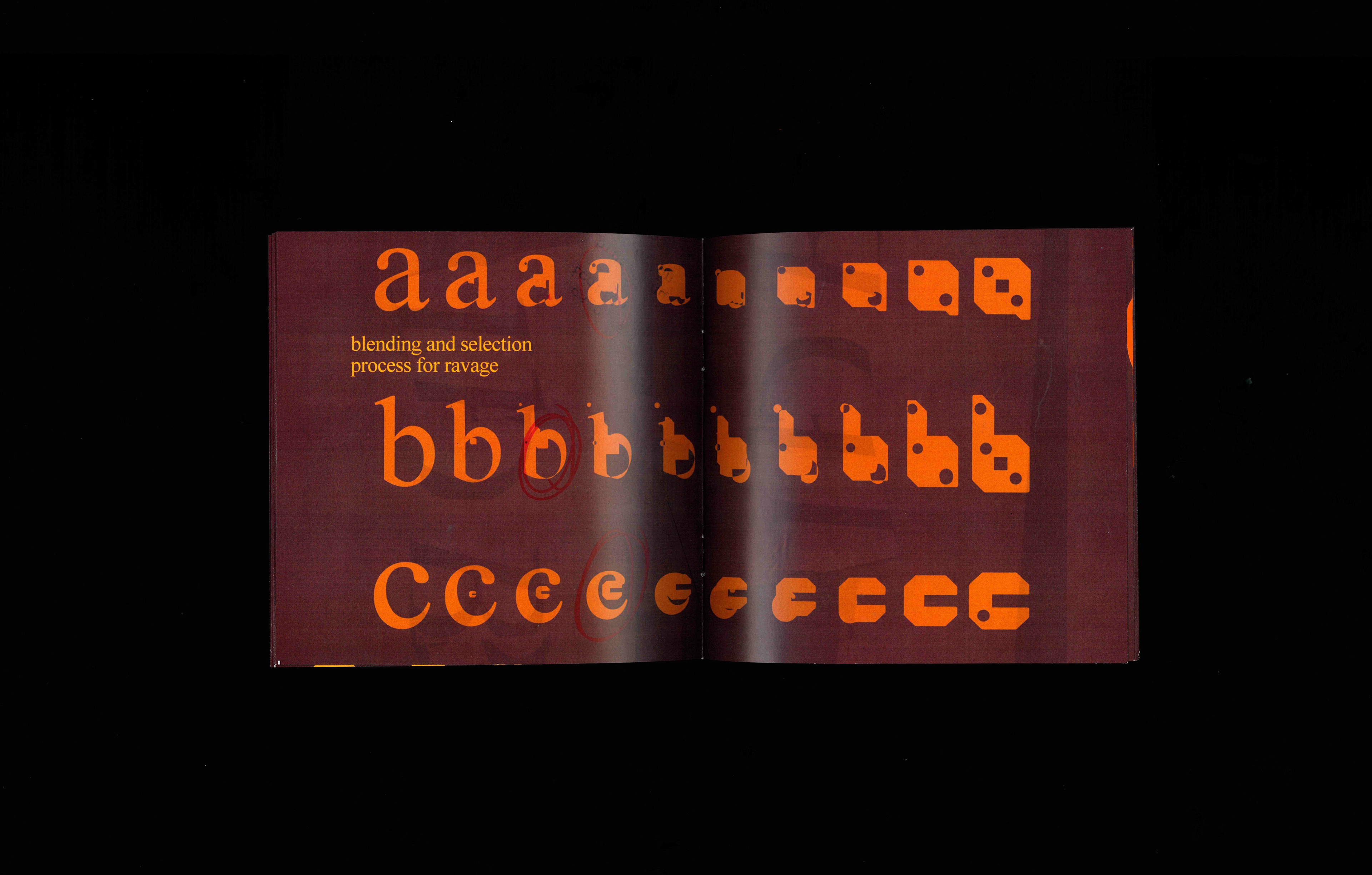
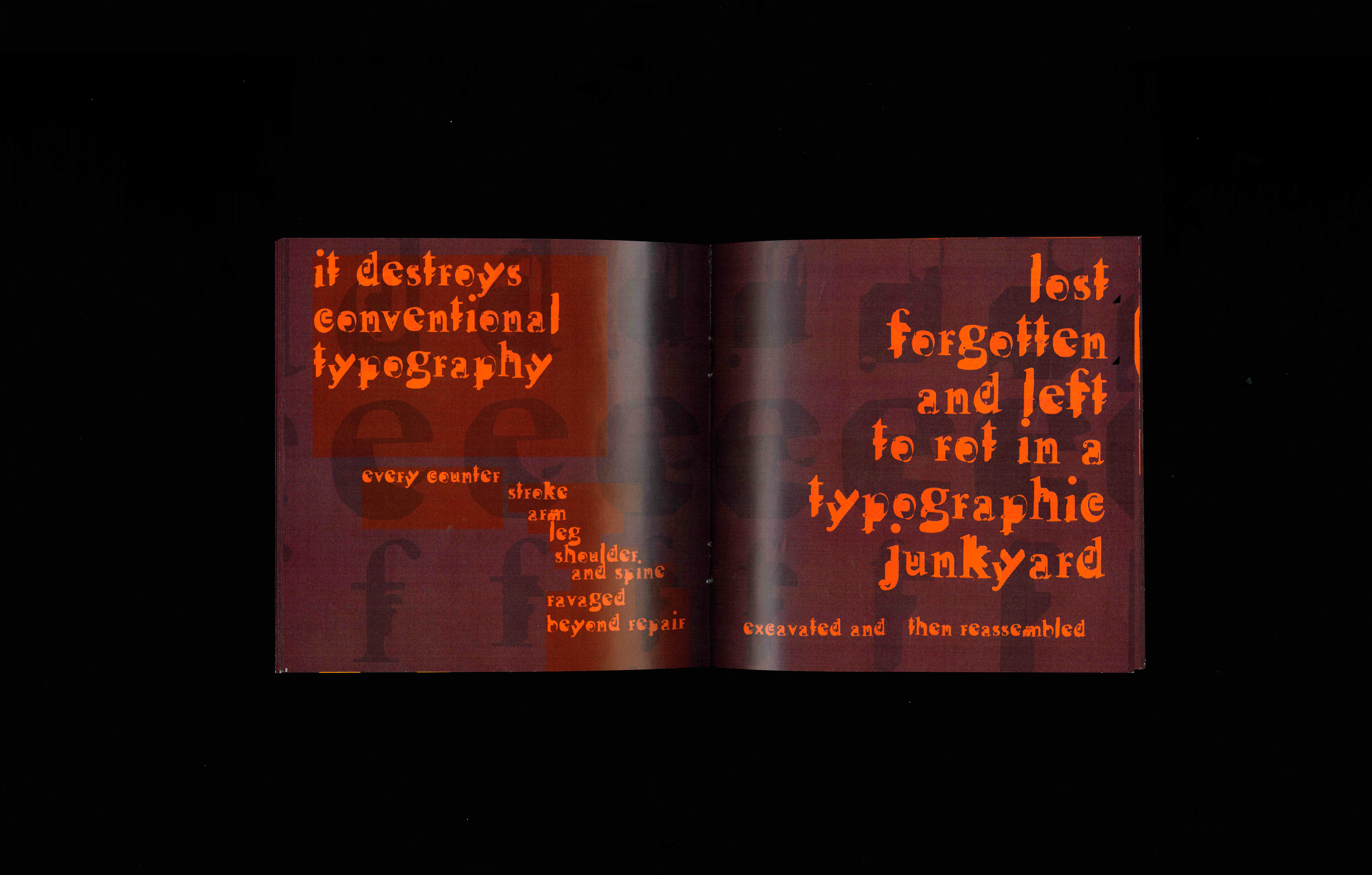
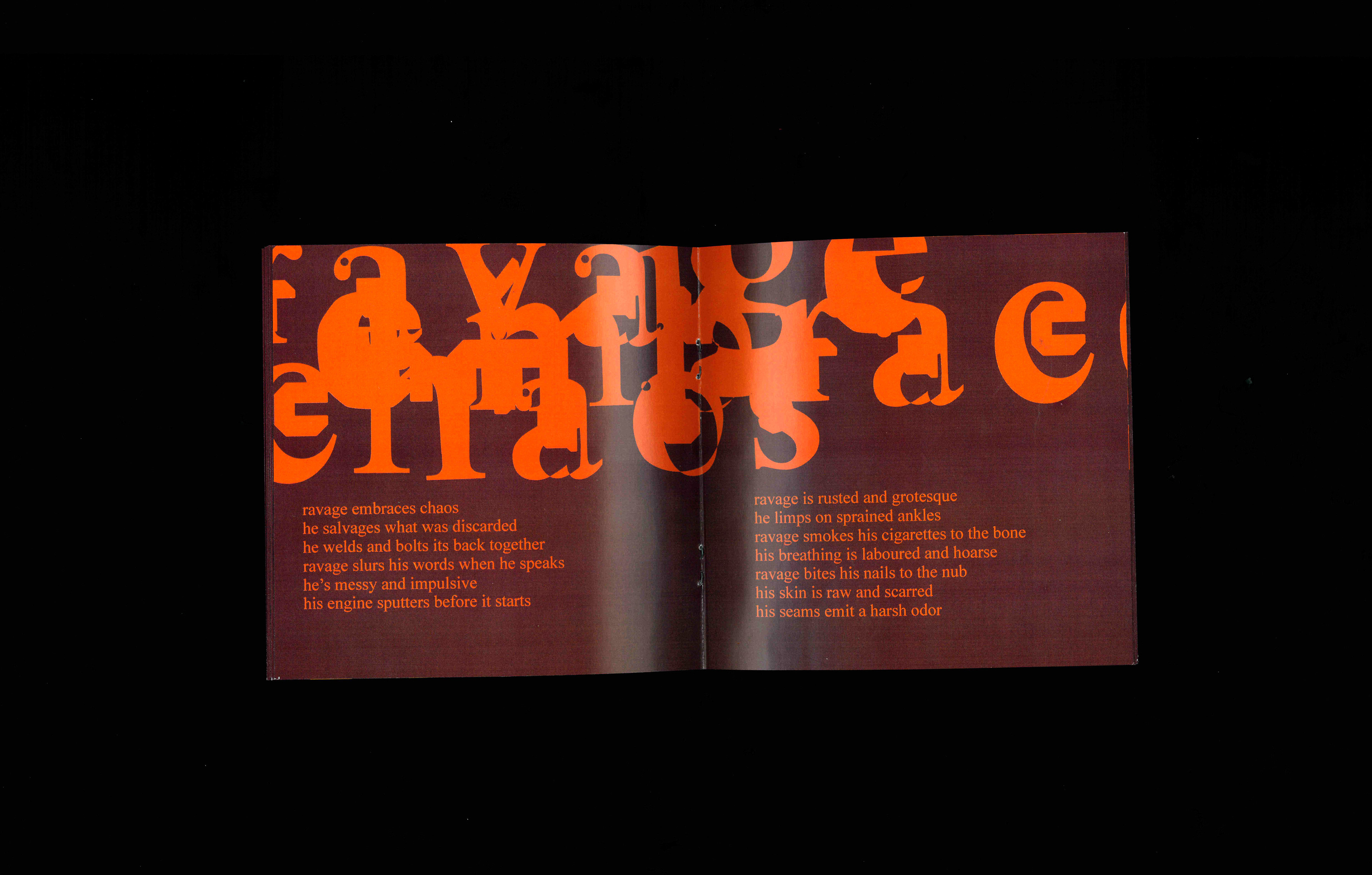
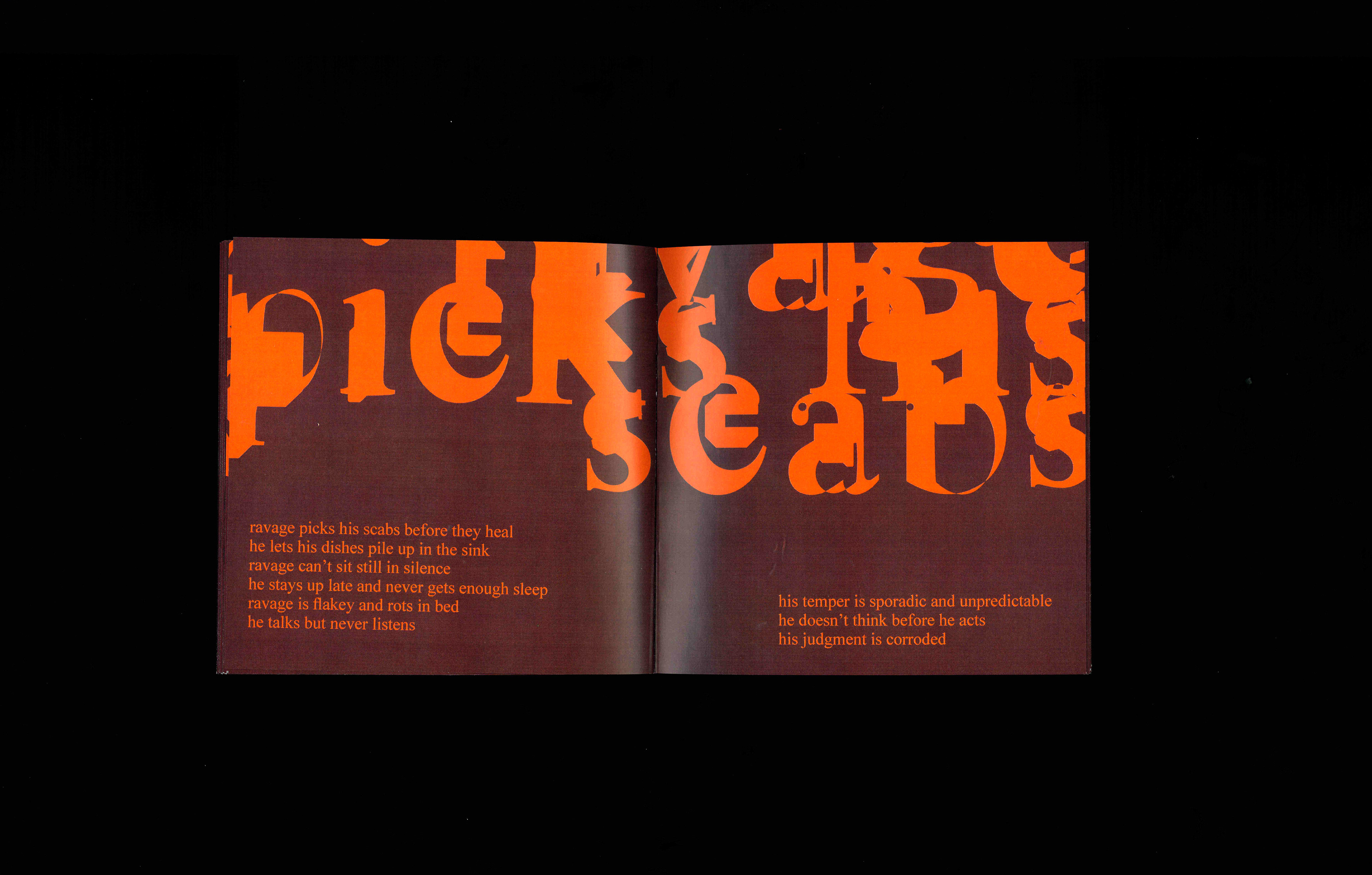
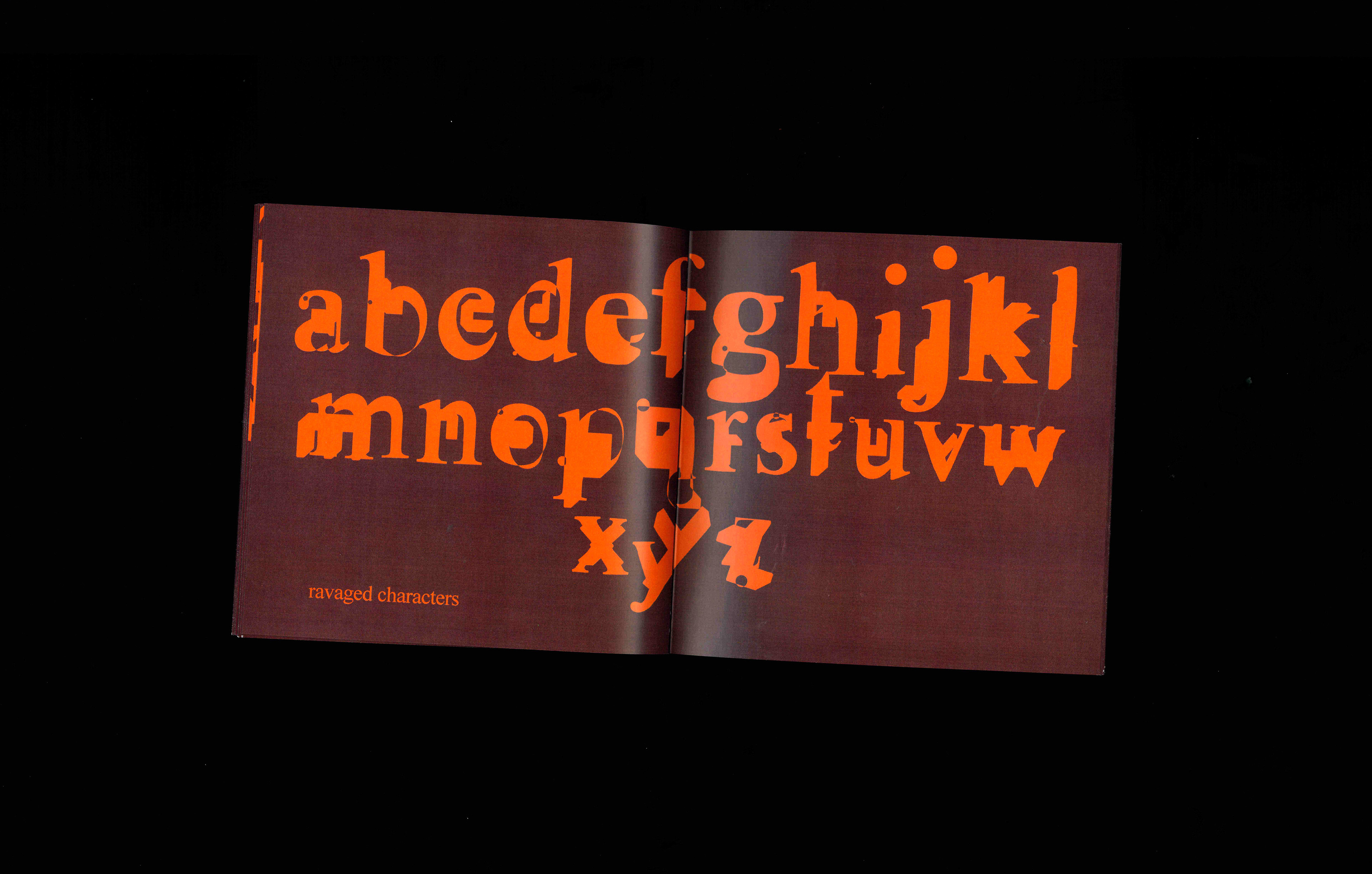
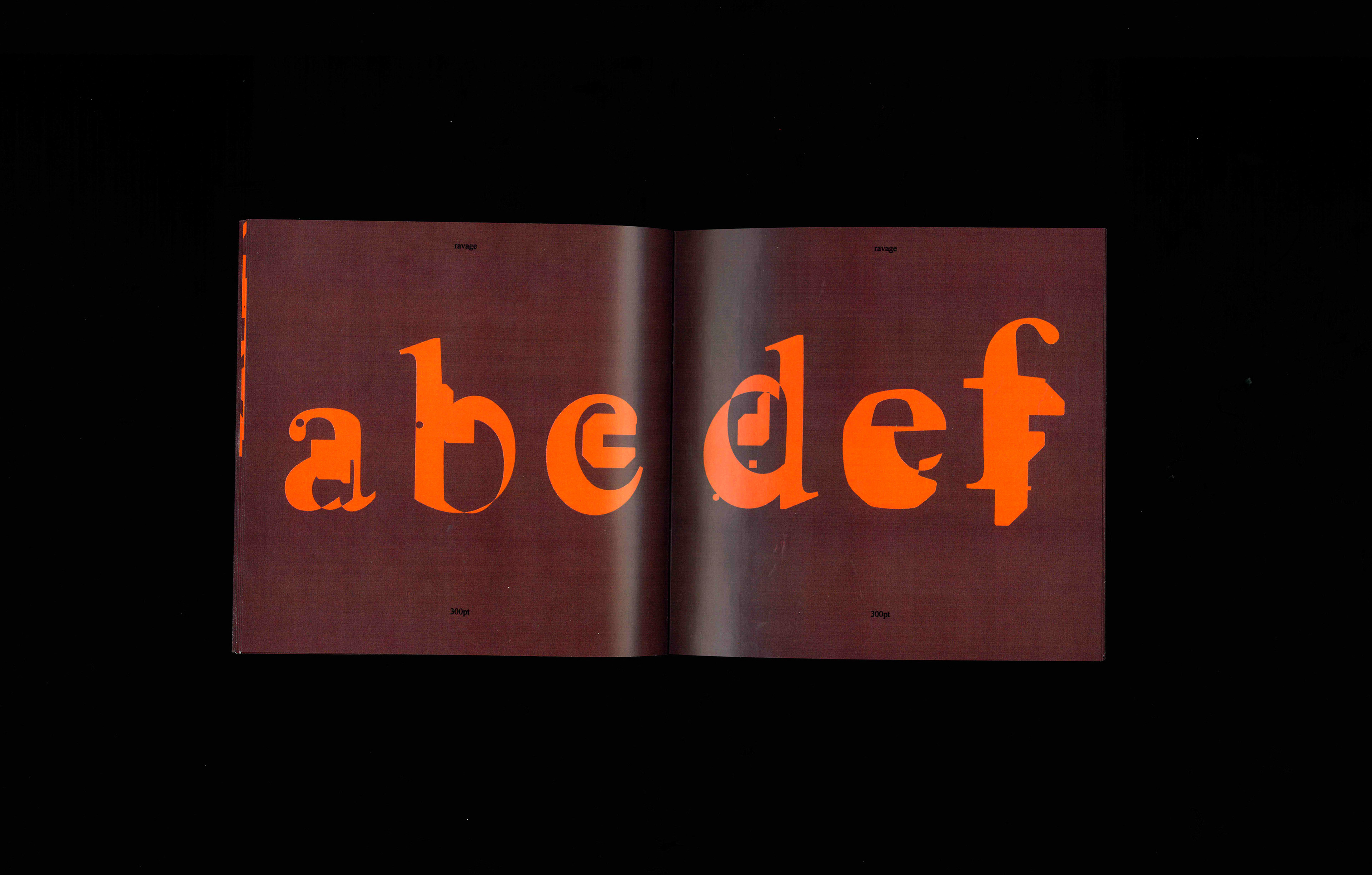
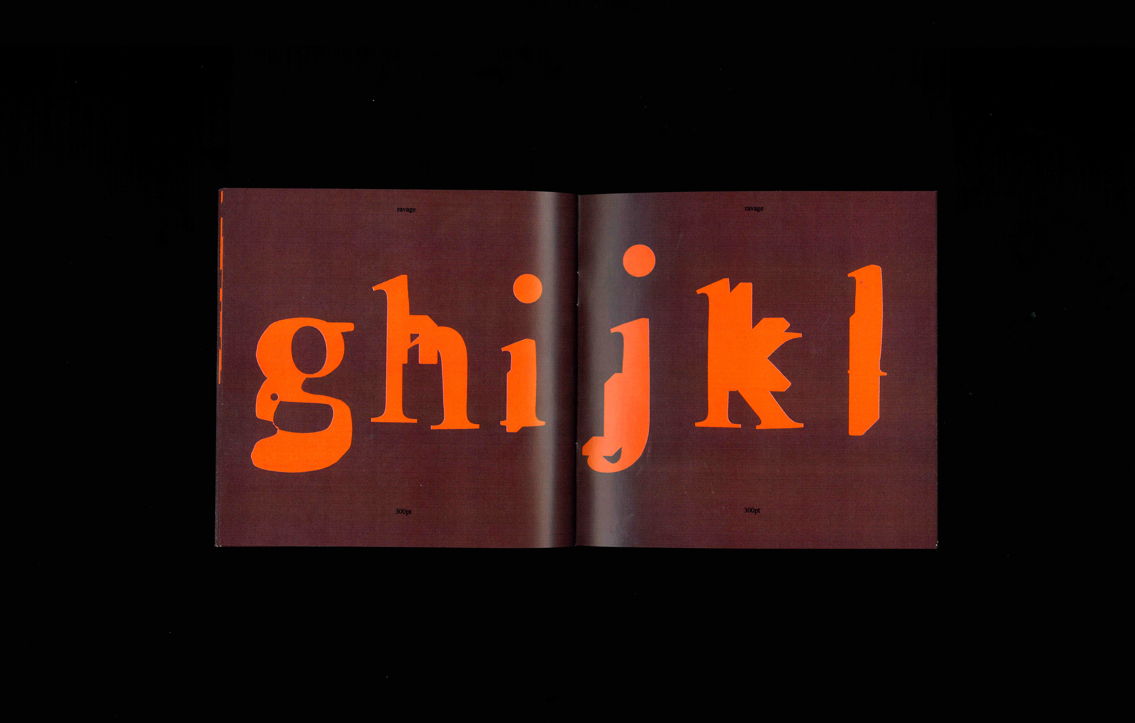
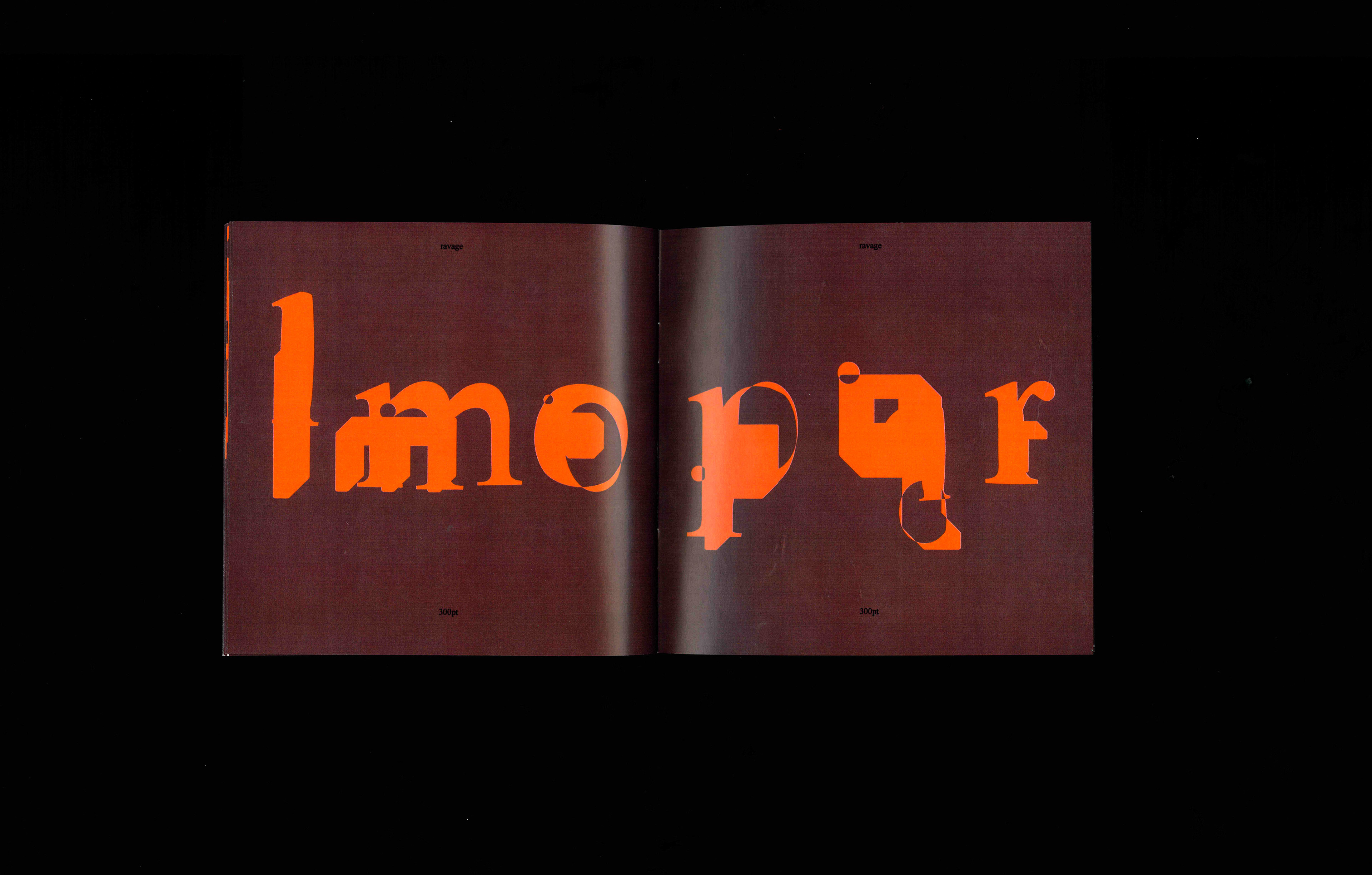
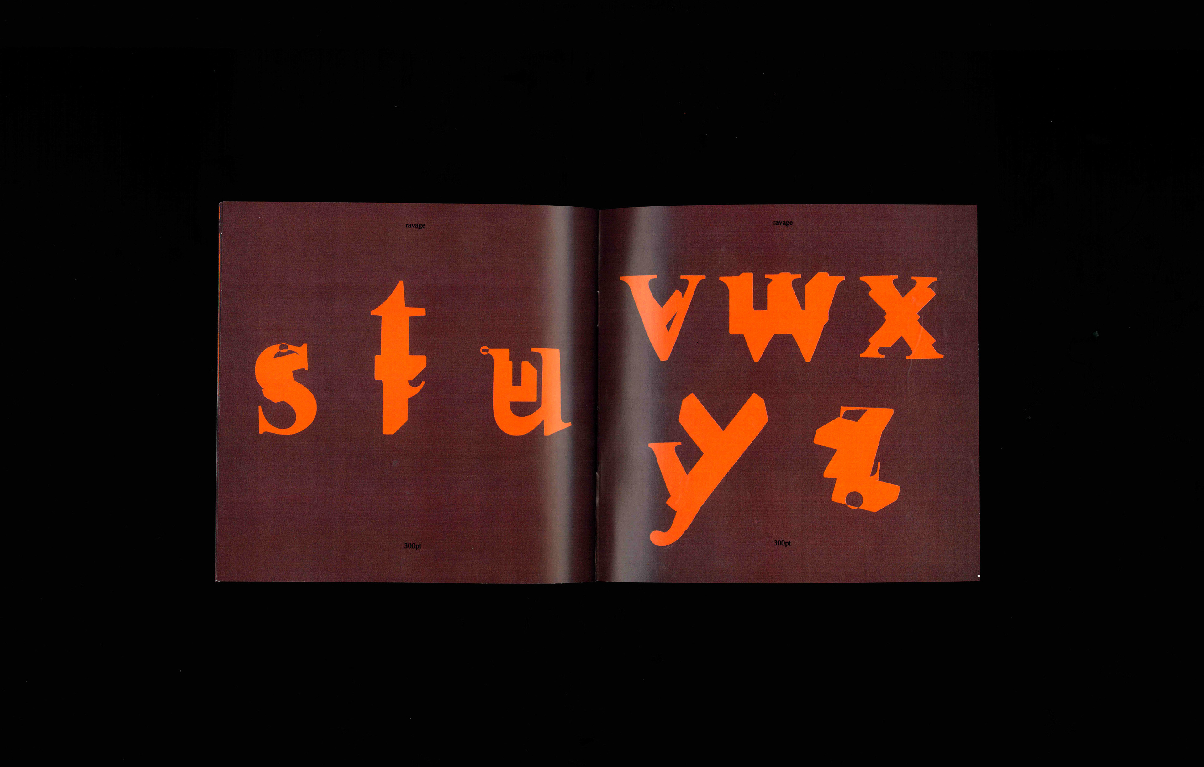
Ravage is a typeface that is beyond repair. A frankensteined synthesis between Times New Roman and a previous typeface I designed, Brackets. This font destroys conventional typography by embracing chaos. Excavated from the local typographic junkyard, Ravage is messy, impulsive, and rusted. Ravage is flakey and untrustworthy, his judgment has corroded. As a publication designer, I’m often constrained by grids, margins, and formats. I’ve seen this impact my work, forcing me to follow strict guidelines to the point where my work becomes indistinguishable from another designer. Recently, I’ve challenged myself to abandon grids, guides, and typographic conventions to make bolder, more experimental gestures. I began to challenge legibility by allowing words to be placed sporadically on the page while playing with leading, tracking and excessive hyphenation. I embraced imperfection and incompleteness. I began to let my work be driven by subversion and displacement, taking what is there and applying principles that don’t necessarily belong. Using contrasting forms and new media, I create awkward, even disturbing harmonies. Ravage is a result of that process of combining forms that don’t belong to create discomfort and uneasiness. Using Adobe Illustrator, I blended two opposing letterforms and selected the most compelling outcomes. As a designer, I’m always looking for new ways to convey information, even if it means sacrificing legibility. This balancing act brings back a striking personality to my work, where each letter can become an artwork in itself.